The Ultimate 2025 Sofa Configuration Guide
Get your free copy todayy!
When shoppers invest time customizing a piece of furniture only to find out their dream combination isn’t available, the result is often friction, confusion, and even lost sales. In the competitive world of online furniture and interior design, how you communicate unavailable configuration options directly impacts conversion, satisfaction, and brand trust. Here’s how modern, user-friendly 3D configurators solve this pain point using proven best practices.
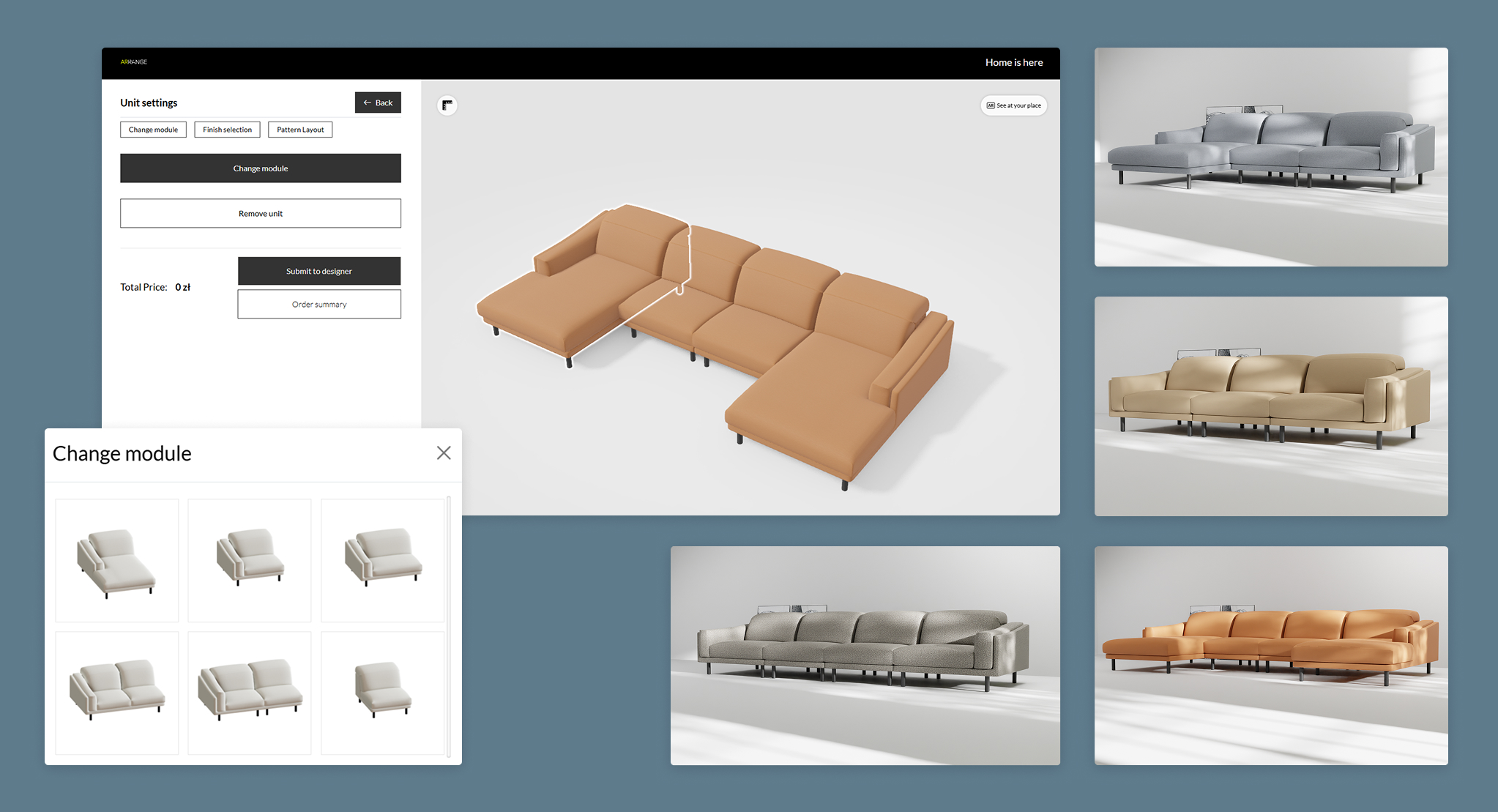
Too often, furniture configurators handle unavailable options by simply greying them out, hiding them, or—worse—letting users spend minutes on a build only to block the “Add to Cart” button at checkout. This wastes valuable customer time and creates the perception that the customization process is broken or misleading. In our work with furniture brands, we’ve seen that such dead-ends directly raise bounce rates and reduce conversion.
Effective 3D configurators solve this with clear, in-context feedback—never leaving the user guessing. As users select features (like special fabrics or leg finishes), unavailable combinations are flagged instantly with subtle tooltips (“Not available with selected color”) or nudged towards similar, available options (“Choose Walnut for availability”). One company improved conversion by 18% after implementing dynamic status updates within their configurator options list, allowing shoppers to adjust choices without starting over. The result: shoppers stay in the flow, feeling empowered rather than punished. This approach aligns with how to reduce cognitive load in a multi-step configurator that emphasizes guiding users smoothly through complex choices without overwhelm.
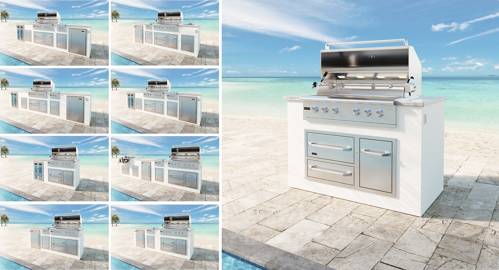
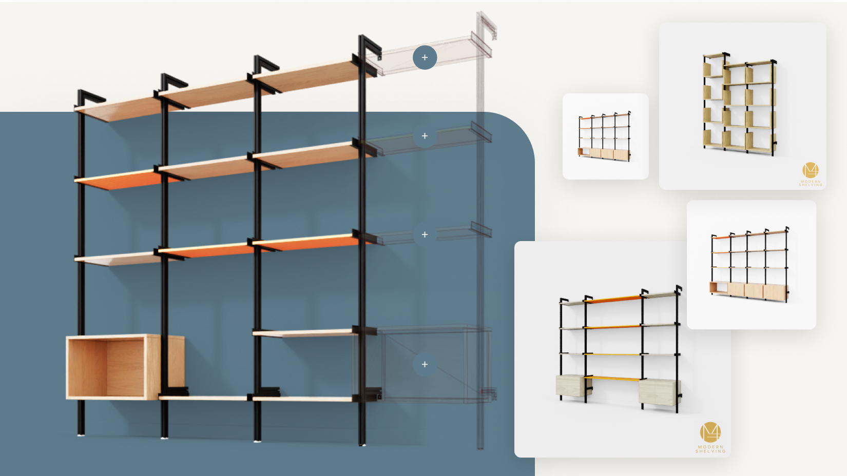
Complex products can have hundreds—even thousands—of possible variants. If users see endless greyed-out swatches or get pop-ups for every restricted pairing, the experience can feel overwhelming and rigid. Showing all possible (but mostly unavailable) configurations quickly makes the brand seem inflexible or confusing. This challenge is discussed in how to avoid confusing the user with too many choices which advocates for segmented and guided configuration processes to enhance usability.
Smart configurators narrow the field by only showing relevant, available options as users progress. For example, if “Velvet Emerald” is only available on certain sofas, the system hides or de-emphasizes it for other models, educating the customer subtly. A direct comparison of option displays shows a stark difference:
| Approach | User Experience | Business Impact |
|---|---|---|
| Show everything (even unavailable) | Confusing, overwhelming, frustration, high exit rate | Order errors, abandoned carts, lower conversion |
| Intelligent filtering (show only relevant, available) | Streamlined, clear, less frustration | Fewer errors, better conversion, higher satisfaction |
One leading modular furniture manufacturer saw a 25% reduction in incomplete configurations when switching to contextual filtering in their online tool. This ties in closely with best practices from why we offer unlimited options isn’t a value proposition, promoting curated choices to improve decision-making.
Simply disabling an option without explanation often results in confusion and a sense of lost control—customers may wonder if it’s a glitch, a future restock, or a design constraint. This can deter buyers from exploring alternatives.
Modern configurators directly explain unavailability with concise tooltips or small on-hover/in-field text: “Sorry, this fabric is currently out of stock for the selected frame due to supplier delays.” Even better, they offer alternatives (“Similar texture in ‘Olive Green’—ships in 2 weeks”). This information-driven approach demystifies the process and encourages continued engagement, not frustration. This mirrors principles emphasized in how to reassure users during configuration that they’re on the right track which advocate for transparency and user guidance to build trust.
Leading brands track metrics after UX changes:
A/B tests reveal users much prefer being gently nudged toward an available, similar choice rather than facing a hard stop. ROI analysis across several client deployments has shown that effective unavailable option handling can directly lift online revenue by 10–20%, thanks to rescued shopping sessions and fewer order errors. These outcomes demonstrate how how does a configurator shorten the sales cycle benefits from clear, interactive feedback and validation.
Unavailability shouldn’t be a roadblock—instead, it’s an opportunity to guide, educate, and even upsell. The best 3D configurators reduce friction by dynamically responding to user actions, filtering out noise, and providing immediate, transparent feedback. They turn disappointing dead-ends into seamless redirects toward satisfaction. Aligning with how a configurator can help upsell or bundle products, this approach turns limited options into curated opportunities.
Call to Action
Are your configurator’s unavailable options costing you customers? Book a free, 30-minute consultation with our practitioners to receive an audit and discover actionable strategies that turn friction into conversion—without rewriting your entire tech stack.
For further insights on configurator implementation and integrations to maximize effectiveness, you might explore 3D configurators for furniture brands: implementation roadmap and integration strategy. Additionally, understanding what mistakes do most furniture brands make with personalization can help avoid common pitfalls in user experience design.
By leveraging these best practices, furniture brands can transform their customization experience from a potential point of frustration into a competitive advantage that drives conversion, satisfaction, and long-term loyalty.