The Ultimate 2025 Sofa Configuration Guide
Get your free copy todayy!
Every abandoned configuration and dropped cart in your online furniture store is usually rooted in user uncertainty. If customers aren’t sure their personalized sofa is being built how they want—or if they fear making a wrong choice—they’re more likely to quit the process altogether. This article explains actionable ways to reassure users during every step of their 3D configuration journey, using proven UX and backend strategies from leading furniture brands.
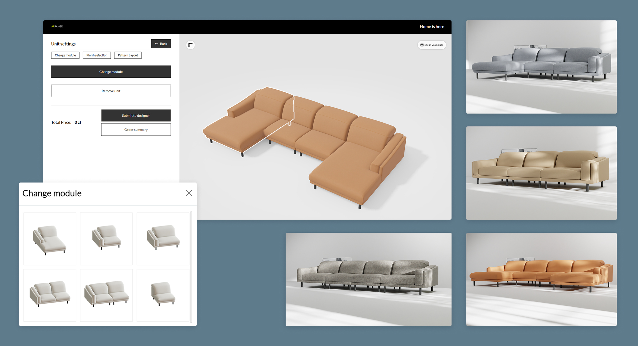
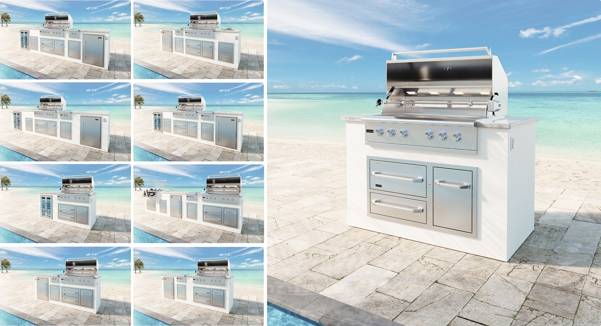
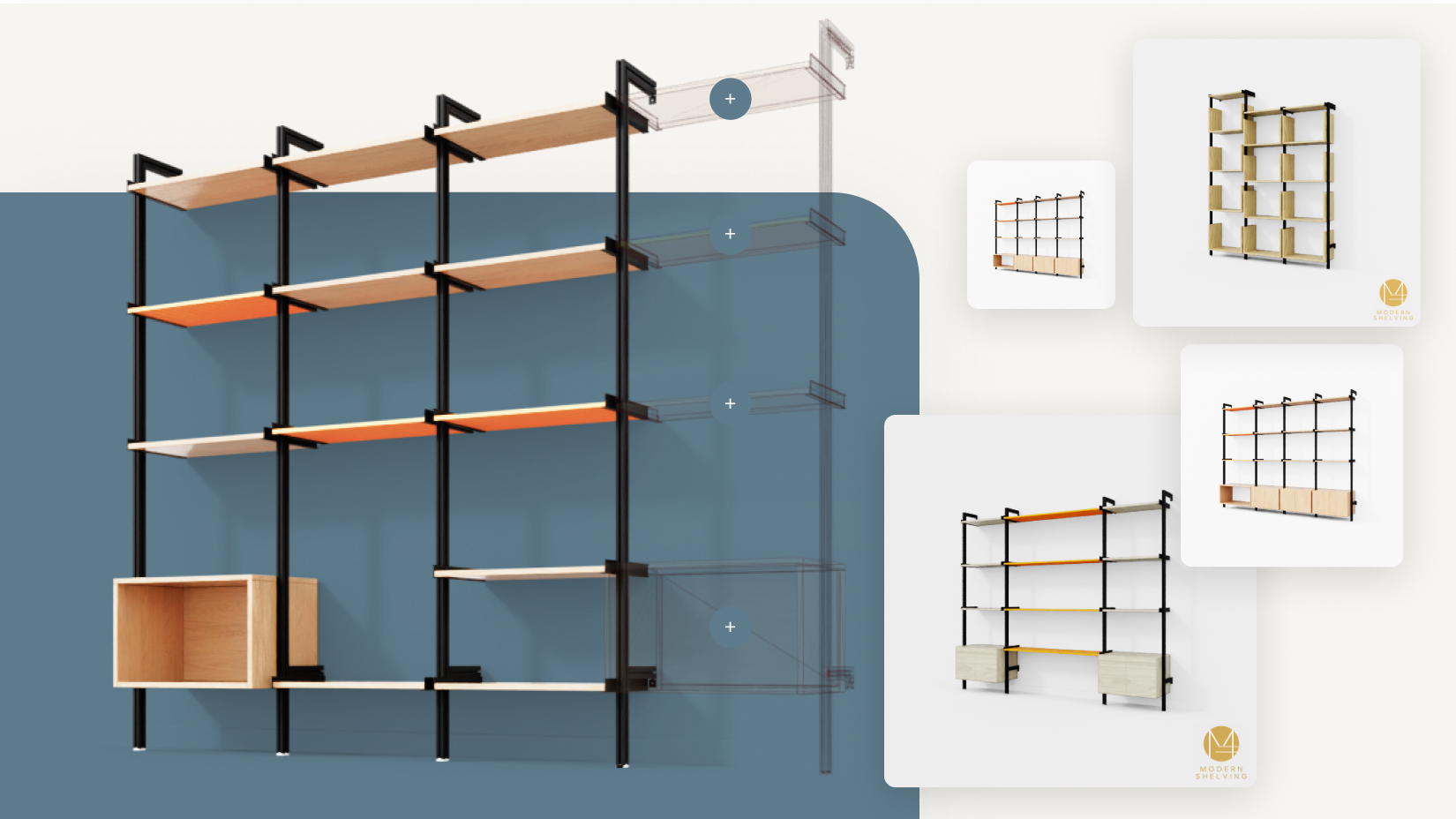
Pain Point: When users change options—like fabric or leg style—but don’t see instant, accurate product updates, they get confused or anxious. If there’s any disconnect between their intent and the visualization, doubt sets in. This leads to a high bounce rate and abandoned carts.
Solution: Robust 3D furniture configurators provide live, crystal-clear visual updates as users make changes. Showcasing the exact combination chosen (with accurate materials, colors, and scale), alongside zoom and rotate features, bridges the gap between “what I chose” and “what I see.” This level of transparency drastically reduces user hesitation and increases completion rates, as seen in case studies from modular sofa and custom shelving manufacturers.
| Feature | 2D Preview | 3D Configurator |
|---|---|---|
| Real-time visual updates | Limited, static image | Yes, every change |
| User confidence | Low | High |
| Error reduction | Minimal | Significant |
| Complex product handling | Challenging | Effortless |
Pain Point: A broad range of attributes (size, fabric, add-ons, delivery options) can overwhelm users, leading them to fear missing an important step—which kills conversion.
Solution: Modern configurators break the journey into clear, bite-sized steps, highlighting the current stage and next action with visible progress markers. Best practices include emphasizing “Required” choices, graying out unavailable combinations, and prompting with helpful tooltips. This structured flow ensures users always know exactly where they are, what’s left, and validates each selection, mirroring the most successful approaches in configurable kitchen and wardrobe projects and drawing on insights from articles on reducing cognitive load in multi-step configurators and wizard-style UI designs.
Pain Point: Users often worry if their selections have “stuck”—will the order match what they see? Uncertainty at this phase often triggers abandonment or costly customer support queries.
Solution: Before checkout, display a summary page with a high-fidelity product image (reflecting all choices), clearly listed specs, and price confirmations. Allow users to easily edit selections directly or download/share the final design. Some brands also provide AR previews or instant PDF/contract exports, further reinforcing that “this is exactly what you’re ordering.” Results: Fewer post-purchase disputes, lower returns, and happier customers. This approach aligns with recommendations in the article about sending customers a PDF of their design after the session and strategies for building customer trust through visualization.
Pain Point: Furniture decisions aren’t always made in a single session—especially for higher-ticket custom pieces. Users may need time to consider, share with others, or consult in-store.
Solution: Let users save configurations without mandatory registration or enable guest accounts with easy upgrade options. Offer incentives (discounts, design consultations, AR home previews) if they choose to register. When they return, greet them with their saved design ready to continue—no need to re-enter details. This flexibility, adopted by top-tier modular and office furniture brands, both reassures and respects the user’s buying process. This insight builds on best practices from the article on allowing guest users to save their configuration and the integration of augmented reality as a confidence booster.
| Feature | User Benefit | Business Impact |
|---|---|---|
| Real-time 3D preview | “I see what I’m getting” | Higher conversion, fewer returns |
| Guided progress steps | “I won’t get lost or miss anything” | Lower abandonment, faster decisions |
| Confirmation summary | “My order matches my design” | Fewer errors, less support needed |
| Saved/sharable configs | “I can pause and share safely” | More completions, wider reach |
Every point of friction—be it unclear visuals, confusing flow, or lack of reassurance—costs you sales and trust. By implementing robust 3D configurator features that guide and reassure users at every step, you’ll reduce confusion, increase confidence, and boost completion rates just like the top performers in the market. These principles echo the broader benefits of configurators that shorten sales cycles and reduce cart abandonment.
If you’re ready to see how these best practices can be tailored to your product range, schedule a free 30-minute consultation. Let’s make your configuration journey as seamless and reassuring as possible—for you and your customers.