The Ultimate 2025 Sofa Configuration Guide
Get your free copy todayy!
Shoppers expect to customize furniture on their phones with ease, but most mobile configurators feel cluttered, sluggish, or impossible to use. This directly impacts conversion rates, increases order errors, and results in frustrated customers abandoning their journey. Here’s how to structure a mobile-friendly configurator UI that streamlines complex furniture customization for touch devices—while driving better business results.
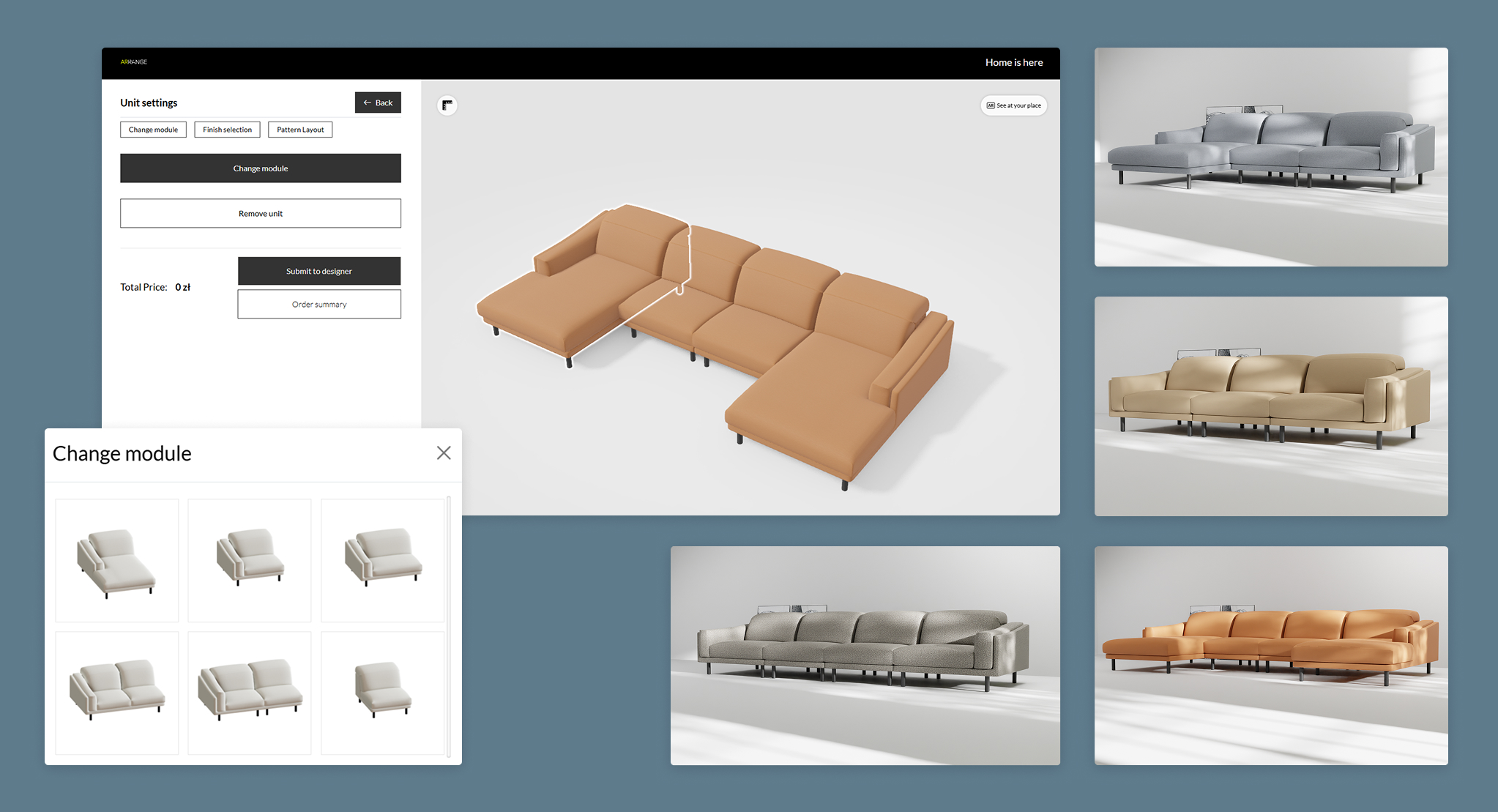
Mobile users are easily overwhelmed by too many options cramped into a small space. When configurators try to replicate desktop UIs—showing dozens of fabric swatches, modular add-ons or dropdowns—the result is indecision and drop-off.
Design your mobile furniture configurator using progressive disclosure: present only essential choices at each step, and reveal advanced options as needed. Use bite-sized, wizard-like steps with clear “next” actions and contextual tips (“Choose fabric first, then add accessories”). For example:
| Approach | Result on Mobile |
|---|---|
| All options shown at once | Screen clutter, confusion, high bounce |
| Step-by-step, guided flow | Focus, faster decisions, higher conversion |
Manufacturers implementing stepwise customization (especially for modular sofas or wardrobes) report increased completion rates and reduced support queries, since users feel guided rather than overwhelmed. This approach aligns with strategies discussed in how to reduce cognitive load in a multi-step configurator and the difference between a wizard-style UI and a free-explore UI, which emphasize structured flows to enhance user experience.
Nothing kills engagement faster than a slow-loading configurator. Heavy 3D models, unnecessary animations, or too many visual effects make mobile experience laggy—especially on average devices and non-flagship phones.
Prioritize speed. Use light 3D models or even high-quality static renders when full 3D isn’t required (e.g., for fabric and finish changes). Minimize animations and focus on fast transitions. Real-life insight: brands that focused on lightweight models and performance-first UI saw session times triple, with drop-offs halved.
This echoes the guidance in why user experience matters more than visual fidelity in some cases and is it better to use pre-rendered visuals or real-time rendering, highlighting the trade-offs between fidelity and performance.
Accidental selections and hard-to-tap buttons are a top source of friction. When users frequently mis-tap or struggle to compare swatches, frustration rises—and sales drop.
Design for the real-world context of one-handed use:
Usability studies from leading furniture brands show that customers complete configurations up to 25% faster when options are made thumb-accessible and grouped intuitively. This principle relates closely to should users be able to compare multiple configurations, which discusses features that reduce cognitive load and optimize mobile usability.
When shoppers can’t see how their selections affect the product’s look or price, they lose confidence or abandon their cart. Uncertainty (“How much will this cost?”) turns into lost opportunities.
A best-in-class responsive configurator UI for furniture gives immediate visual and price feedback with each selection. Techniques include:
Manufacturers using real-time updates report fewer abandoned configurations and more direct-to-checkout conversions—since transparency builds trust. These benefits are explored further in why does instant pricing transparency matter so much in personalization and how can a configurator reduce cart abandonment.
| Element | Traditional Desktop UI | Mobile-First UI (Best Practice) |
|---|---|---|
| Navigation | Top menus, dropdowns | Stepper flow, bottom nav, swipeable cards |
| Option Display | All variants visible at once | Progressive steps, logic-driven display |
| Controls | Small, mouse-oriented | Thumb-friendly, large touch targets |
| Performance | Tolerates larger 3D models | Prioritizes speed and lightweight assets |
| Price Feedback | Often static/after summary | Real-time, sticky price panel |
A mobile-friendly 3D configurator that’s easy to use doesn’t just look good—it drives measurable gains: higher conversion, fewer quote errors, more self-qualified leads, and better use of your sales team’s time. Don’t settle for desktop-first tools patched for phones.
For more insights on boosting sales and operational efficiency through configurators, see how 3D product configurators improve the sale of modular furniture and how to handle pricing logic in a configurator for modular products.
Take the next step: Schedule a free, 30-minute consultation to review your current mobile configurator’s UX and get actionable advice tailored to your product and customer needs. Let’s make customization your competitive edge—starting with the screen in every customer’s pocket.