The Ultimate 2025 Sofa Configuration Guide
Get your free copy todayy!
Content markdown: Furniture brands that invest in digital product customization often face a silent killer of online engagement: friction in the configuration process. Each click, dropdown, or page reload risks distracting or losing the customer before checkout. Implementing seamless visual transitions—subtle animated effects that visually guide users from step to step—directly addresses these issues by transforming configuration into a smooth, visually driven journey. Here’s a practical guide on maximizing user engagement through effective transition techniques in furniture configurators.
Complex options and abrupt screen changes quickly overwhelm or confuse shoppers, causing higher bounce rates and abandoned carts.
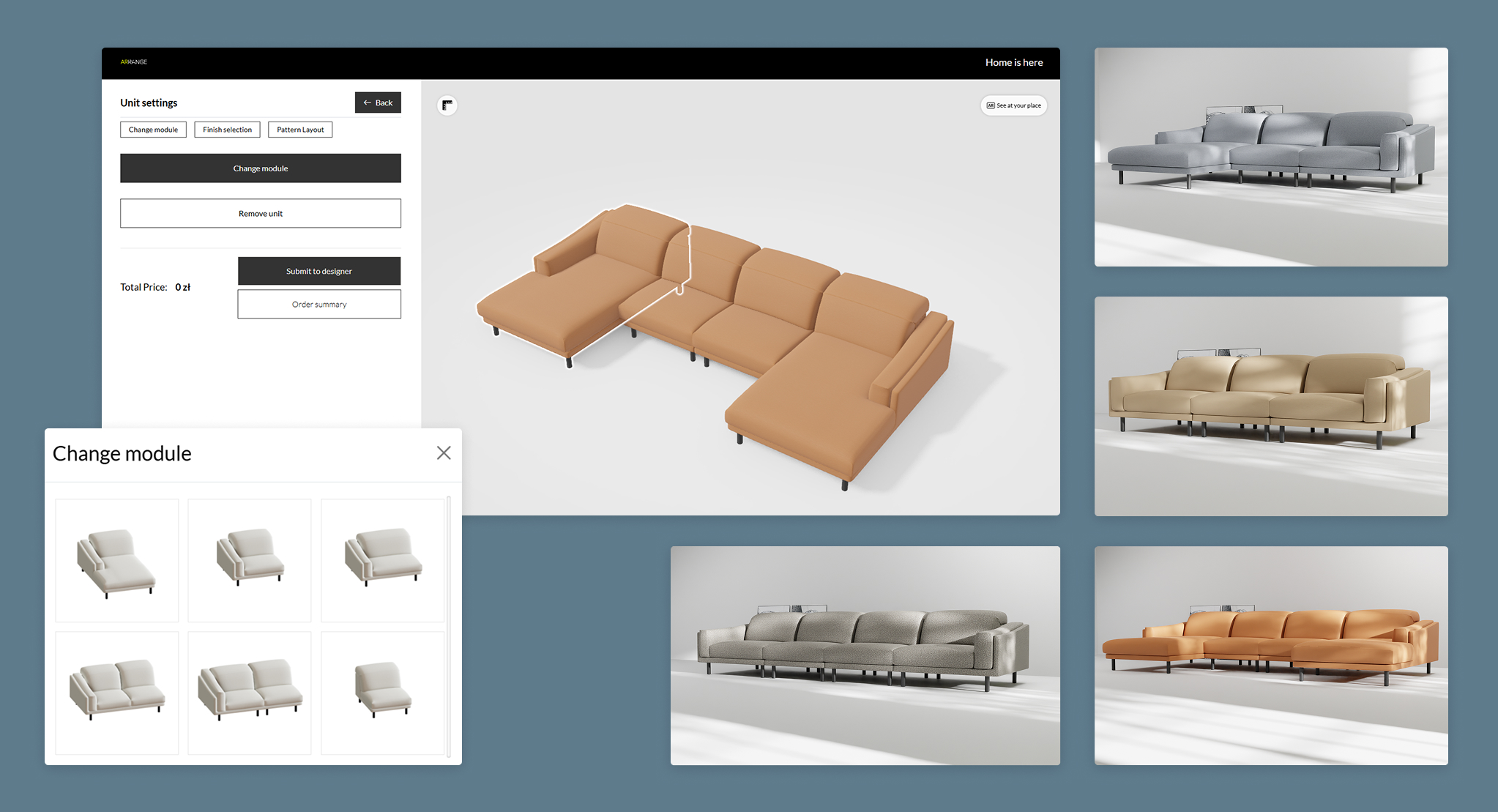
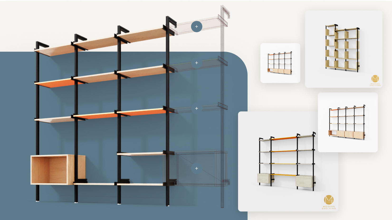
Thoughtful use of visual transitions in 3D configurators can gently guide users through each customization step. For example, animating the transition between sofa styles or fabric options (e.g., fabrics sliding in or color fields fading smoothly) visually signals that a change is happening, keeping the user oriented and reassured. Market implementations show that brands such as Heal’s use visual “before and after” slides and animated changes to clearly show the impact of every configuration, letting users instantly grasp the difference without reading lengthy descriptions. This not only keeps engagement high but also reduces time-to-cart by removing hesitation or second-guessing. For brands looking to improve navigation and minimize overwhelm, how to avoid confusing the user with too many choices offers useful insights on stepwise guidance and curated options.
Online shoppers can’t touch or see products in person, making them nervous about decision quality—especially for big-ticket furniture purchases. Lacking vivid, real-time feedback lowers conversion and increases pre-sale support costs.
Configure in real time with photorealistic 3D transitions that reflect every option change instantly. Techniques like morphing animations when switching from one armrest style to another or shadow/light transitions that simulate real materials provide powerful reassurance that the digital preview matches the physical product. According to data from furniture manufacturers deploying 3D viewers, such dynamic rendering increased conversion rates and reduced customer service contacts about “what-if” questions, showing the tangible ROI of investing in visual transition technologies. These effects align closely with best practices covered in why user experience matters more than visual fidelity in some cases, emphasizing clarity and responsiveness over mere complexity.
Even small moments of user distraction—like a delayed image update—can break customer flow, leading to frustration. Slow, clumsy transitions remind users of tech limitations rather than your product’s appeal.
Leverage micro-animations such as instant fade-ins, subtle scaling, or texture swipes to make every interaction feel intentional and responsive. Instead of the entire screen reloading, only the changed part (such as a cushion color or leg finish) animates, keeping users’ mental focus on their design rather than on website mechanics. Practically, brands employing this method see up to 30% more time spent in the configurator and a marked decrease in cart abandonment. This user-centric approach ties into strategies discussed in why configurators should support the sales pitch, not replace it by enhancing engagement through subtle visual guidance.
| Feature | Static/Clunky Transitions | Seamless Visual Transitions |
|---|---|---|
| User Orientation | Frequent confusion, disjointed | Clear, guided flow |
| Engagement Time | Lower (drop-off risk) | Higher (more exploration) |
| Conversion Rate | Lower | Higher |
| Customer Support Questions | More | Fewer |
| Brand Perception | Outdated, frustrating | Innovative, user-focused |
| Implementation Time/Cost | Shorter/cheaper at start | Higher upfront, better long-term |
| ROI (after 12 months) | Unchanged or negative | Positive, measurable uplift |
Commodity photography and generic interactions fail to spark customer imagination or emotional buy-in—a critical gap for considered purchases like furniture.
Use transition effects as narrative moments. For instance, a staged “day-to-night” lighting animation or a split-view fade between “old” and “new” living room setups can trigger aspirational, emotional reactions. This is a best practice seen in brands creating lifestyle-centered 3D configurators, where transitions are timed to tell a story, reinforcing how the furniture upgrades not just a space, but a lifestyle. The result? Visually engaged, emotionally invested users who are more likely to purchase. For more on integrating lifestyle imagery into configurators, see what's the role of lifestyle images in a configurator.
Visual transitions aren’t just “nice-to-have” effects—they are business-critical levers for reducing friction, boosting engagement, and improving online furniture sales conversion. If your configurator still suffers from abrupt jumps or static image swaps, you’re leaving customer satisfaction and revenue on the table.
For guidance on upgrading your configurator holistically, including integration with sales and ERP workflows, check out how can a configurator integrate with my ERP system and how does a configurator shorten the sales cycle.
Want a clear plan on how to upgrade your furniture configurator’s visual transitions—or curious how best-in-class brands do it? Schedule a free, 30-minute consultation. Get actionable advice tailored to your current platform and business goals—and start turning every step of the configuration journey into a competitive advantage. Explore implementation strategies at 3D configurators for furniture brands implementation roadmap to ensure success.