The Ultimate 2025 Sofa Configuration Guide
Get your free copy todayy!
Mitto Home makes premium upholstered furniture and sells most of it through a screen. The brand’s promise is “feel the colour,” but online nobody can feel anything - the render and a posted sample carry the whole decision. Get the colour or the weave wrong and you have broken the one thing they sell on. So we hand-built every fabric and ran 3,500 4K images through it, each one made to convince a buyer who knows fabric, and the architects who specify it.
We have rendered millions of variants for other clients, so volume was never the worry here. The worry was that each frame had to survive a close look, and for a brand like Mitto Home that is the whole job.
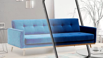
When the photo is what sells the piece, a wrong material reads instantly. Get the sheen of a velvet off and a four-figure sofa starts to look like a budget one. The customer can’t always name what’s wrong, but they feel it and they scroll on.
The fabrics were where this got hard. Two of them in particular gave us weeks of work.
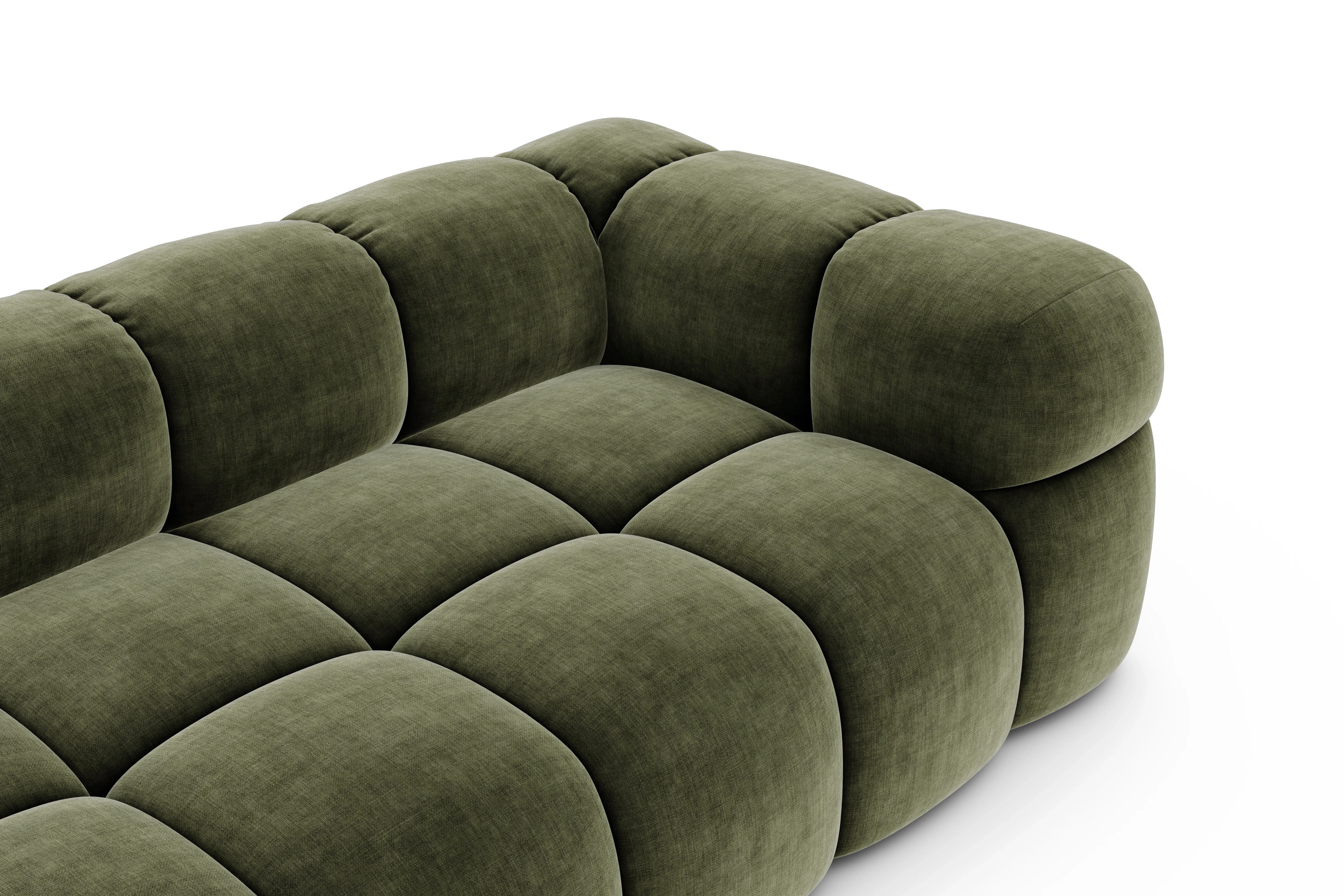
Fargotex Golden is a velvet chenille. It’s woven so the structure shows on the surface, and it carries a soft sheen that travels as you move past it. In graphite it lifts almost to silver under a light, then settles back to charcoal in shadow. Drop a flat material onto that geometry and you get grey felt. We built the weave into the normal and bump maps, layered a fresnel-driven sheen over it, and hand-tuned the two-tone shading until a render of Golden in graphite matched the physical swatch we were holding up next to the monitor. Its 110,000-cycle Martindale durability is a selling point for the brand, but none of that matters if the picture looks cheap, so the picture had to be right first.
Fargotex Corbett was the other one, and it’s the opposite problem to a velvet. Corbett is a structural basketweave where threads in several close shades interlace into a salt-and-pepper melange under one leading colour. Render it as a flat fabric and it dies on screen: the colour goes muddy and the surface turns to plastic. The weave had to be real geometry so it caught raking light and showed its depth at close range, and the colour had to be mixed from the actual yarn tones so the salt-and-pepper held at arm’s length without tiling into an obvious repeat across a whole headboard. We built the structure as displacement, drove the colour from a blend of the real thread shades, and tuned it until Corbett read as one warm colour from across a room and resolved into its weave up close.

Neither of these was a slider you nudge. Each was a Blender shader graph dozens of nodes deep, built against the real swatch, broken, and rebuilt, then locked so every colourway in the collection inherited the same physically-correct behaviour. The metal bases got the same treatment on a smaller scale: a silver finish with a graphite sheen that the first pass rendered too dark and too orange, corrected against the actual part.
We set the look once and then defended it. Lighting, camera and staging locked up front in Blender, a real material authored for every fabric and finish, signed off against physical swatches before anything went to scale. From there Python took over: scripts drove the whole collection through the locked scene, swapping materials, framing and exporting each shot, so 3,500 4K renders came out the far end carrying the work we’d already proven on the swatch. A new finish drops into the same pipeline and comes out matching everything around it.
_2026-06-19_13-49-24.jpg)
_2026-06-23_12-30-57.webp)