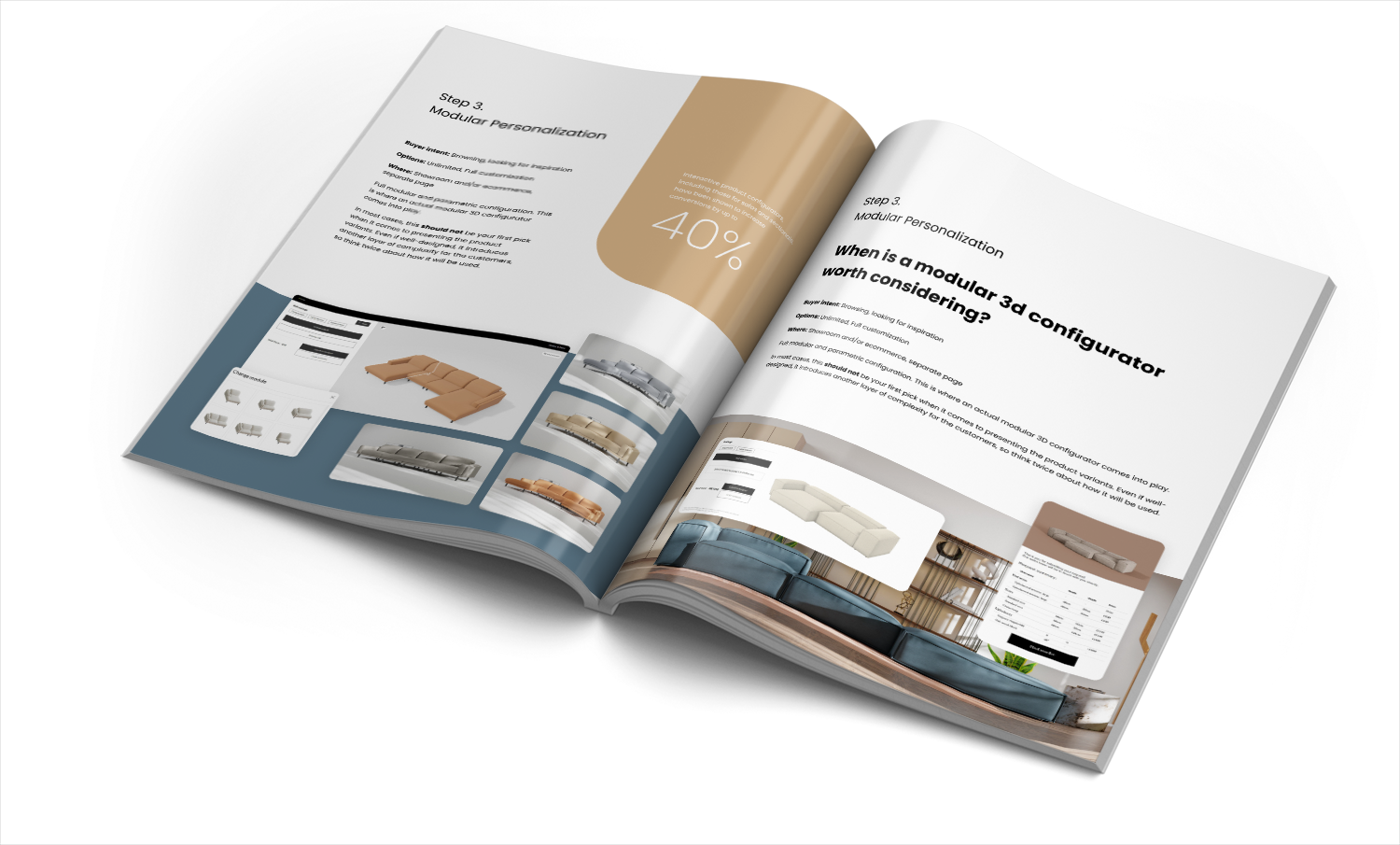
The Ultimate 2025 Sofa Configuration Guide
Get your free copy todayy!

If you’ve ever tried buying a sofa online, you know the drill: you zoom in, you check a few angles, and then… you hesitate. Because you can’t touch it. You rely completely on what you see. That’s why product images are the silent salespeople of every furniture brand.
For high-ticket items like sofas or dining tables, photorealistic images do more than show what’s for sale - they build trust. Even if your website features a product configurator, static visuals still matter. A 3D preview helps customers explore options, but it’s those beautiful, lifelike photos that reassure them the product is real, tangible, and worth the price.
At Ar-range, we often say: a configurator without great imagery is like a GPS without a map. It gives direction, but no sense of place. So let’s unpack how many images you truly need per product page - and what kind of images actually move people from browsing to buying.
Here’s what I’ve seen over and over: brands either go too light or too heavy on visuals. Too few, and the shopper doubts what they can’t see. Too many, and they lose focus. The right balance depends on the story your product needs to tell.
Simple items - think a wooden stool or a small lamp - can usually stand on one or two clear images. But with high-ticket items, where materials, stitching, and proportions matter, customers expect a fuller visual journey.
This isn’t just about aesthetics. Every image adds data. Each frame, angle, or detail plays a psychological role: confirming scale, proving quality, and reducing risk. When people feel visually informed, they stay longer on the page and engage more deeply. According to Which PDP Images Improve E-Commerce Experiences? - Fabric Inc., most high-performing PDPs feature around six images spanning hero shots, close-ups, and lifestyle imagery.
For big purchases, one angle never tells the full story. I recommend planning your product images like a mini photoshoot designed to answer unspoken questions:
From our internal research, stacking around 5–10 high-quality images per product is the sweet spot. Upholstered pieces should always include at least one fabric detail close-up per available material. That means a lot of images - sometimes millions when variants multiply. That’s exactly where our Automated Product Visuals come in. They generate automated variant visuals, giving you photoreal shots for every finish without manual rendering.
A great example is our work with Scandic Sofa. The brand offers deeply customizable modular seating - hundreds of combinations, each with unique fabrics. Their challenge wasn’t design; it was scale. How do you show it all without drowning your team in image production? Our solution automatically created consistent variant renders so every option looked beautiful and believable. You can read the full story here: A Smarter Visual Experience for a Personalization-Driven Brand.
Most guides treat static pictures as the endgame. But we’ve seen that interactive visuals are what truly change customer behavior. Adding 360-degree views or augmented reality dramatically boosts engagement and conversion rates.
Research shows 360-degree views can lift conversions by nearly 49%. Think about it: spinning a product mimics real inspection behavior. It gives freedom. It builds what I call “choice confidence” - the feeling that you’ve explored enough to decide. That’s the heart of trust.
When you replace some overall shots with interactive views, you keep your PDP clean while adding depth. It’s one of the easiest ways to keep people on the page longer and reduce returns. For more on how AR can amplify this effect, check out our detailed piece on Use of Augmented Reality in Furniture E-commerce.
There’s no universal formula for image count. But there are good signals.
The higher the price or emotional importance, the deeper the visual storytelling should run. Customers expect detail proportional to value.
If your furniture line comes with multiple fabrics, colors, or finishes, every variation should get its visual due. And yes, that’s heavy to manage manually. But with CGI-driven automation pipelines like ours, what once took weeks now takes hours. We’ve built systems that auto-render variant sets and synchronize assets across platforms. That’s one of the core capabilities behind our Automated Product Visuals offering - scalable automated rendering that helps product teams focus on what matters: designing great products, not managing images.
For upholstered categories, don’t skip those texture details. Fabric close-ups communicate more than color - they’re tiny proof points of craftsmanship. If you want to see how they create emotional impact, I recommend reading Best Way to Show Upholstery Texture and Stitching.
I’ve seen brands make the same mistake: they invest in a configurator, then skip imagery thinking it’s redundant. It’s not. Configurators excel at customization, but photos win the first click. Without great hero images, users might not even load the configurator.
Another trap? Using the same generic render from catalog to catalog. Repetition looks cheap. Variety builds perceived authenticity.
So if I had to sum it up:
When done right, the difference shows up where it matters most: in customer trust and conversion. Visuals are not decoration; they’re decision tools. And the smartest brands treat them that way.
As Fixtuur points out in Choice & Confidence: PDPs That Convert for Furniture e-Commerce, scalable 3D and CGI visual production is no longer optional. It’s the new baseline of clarity and confidence for modern furniture shopping.
So if you’re wondering how many images you need, think beyond the number. Think about the story you’re trying to tell - and how every frame can make that story feel real.